2026-11-13 · AI Manga Translator
Manga Typesetting: How We Fit Translated Text Into Speech Bubbles
The rules letterers follow when fitting English into manga speech bubbles, and the six typesetting problems we hit building an AI manga translator, each with the fix and before-and-after examples.
Manga typesetting is the step that puts a translation back on the page: the original lettering is removed and the new text is fitted inside each speech bubble so it reads as if it was always there. It is also where machine translation most often looks machine-made. A line can be translated perfectly and still look wrong if it is tiny, spills over the bubble, or is broken into an awkward stack of words.
This post covers the rules professional letterers and scanlation typesetters follow, then walks through the six concrete problems we ran into while building the typesetting step of AI Manga Translator, what caused each one and how we fixed it, with before-and-after examples from the same pages.
Why manga is hard to typeset in English
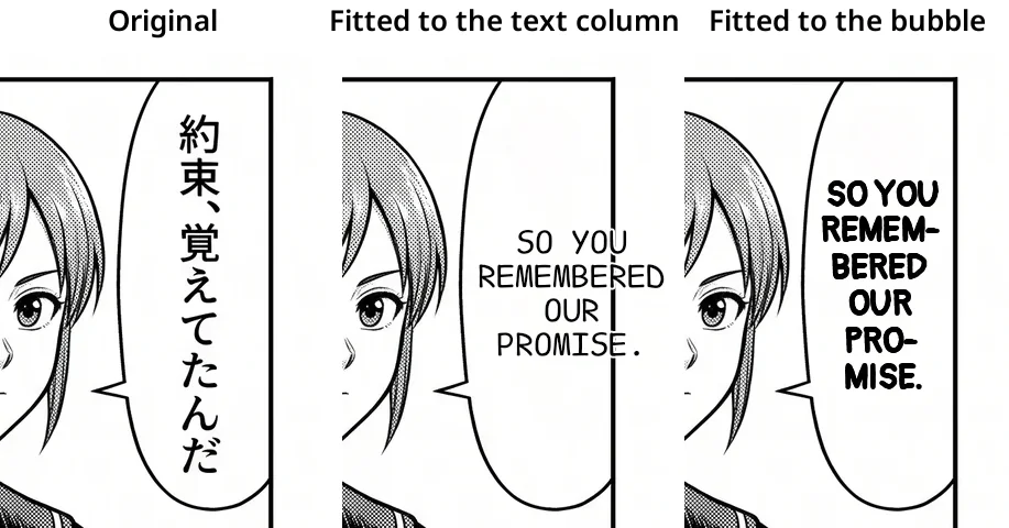
Japanese dialogue is usually written in vertical columns, so manga speech bubbles are often tall and narrow. The line 約束、覚えてたんだ fits neatly in two short columns. Its English translation, "So you remembered our promise," is horizontal, longer, and contains a ten-letter word. Fitting horizontal English into a bubble drawn for vertical Japanese is the core problem of manga typesetting, and every problem below is a version of it.
The rules letterers follow
Comic lettering guides, such as the Comicraft glossary of lettering terms, and scanlation typesetting tutorials agree on a short list:
- One font size for the page. Text should look the same size in every bubble. Don't enlarge text to fill a big bubble; reduce it only when a bubble genuinely cannot hold the line.
- Shape the text like the bubble. In an oval bubble the middle line is the longest and the lines above and below get shorter, a shape letterers call a lens or diamond. Pyramids (each line longer than the last) and hourglasses (a short line between two long ones) are mistakes.
- Centre the text and keep a margin. Text never touches the outline.
- Set lines close together. Comic lettering uses tight line spacing, around 100% of the font size.
- Avoid hyphenation. When it is unavoidable, break only at a syllable.
- Use a condensed comic font, usually in capitals. A narrow font fits more text in the same bubble at the same size.
Six problems we hit, and how we fixed them
AI Manga Translator runs the open-source manga-image-translator pipeline for text detection, OCR, inpainting and translation. Its standard renderer, and our first versions on top of it, broke most of the rules above. Here is what went wrong, in the order we found it.
Problem 1: English sized to the Japanese text column
What we saw: in tall bubbles, the English came out small, sat off-centre and spilled past the bubble's outline.
Why: the renderer sized and placed the English from the box the Japanese text had occupied. A vertical column of Japanese is much narrower than the bubble around it, so the English was squeezed into that column's width, and anything that didn't fit went past the edge.
Fix: after the original lettering is erased, we find the whole bubble: the light, closed area around the text. Layout then uses the bubble's real shape instead of the old text box. Text sitting directly on artwork, with no closed bubble around it, is left to the standard renderer.
Problem 2: text touching the bubble's outline
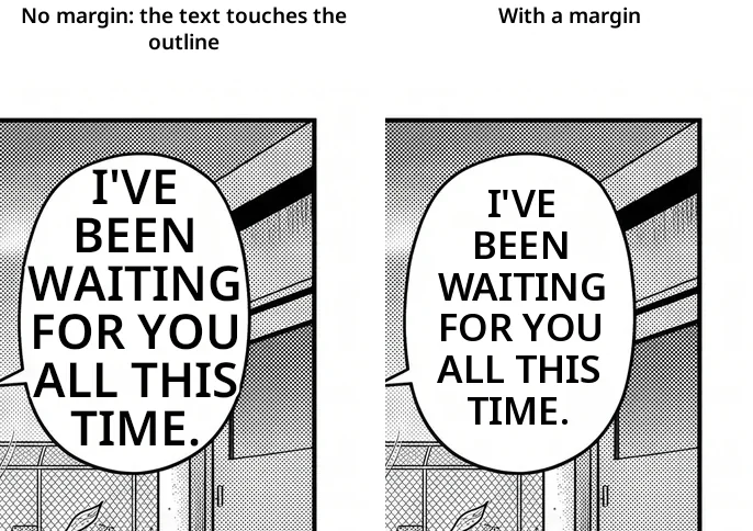
What we saw: once text filled the bubble, the longest lines ran right up to the outline.
Why: we measured the bubble's full width and let lines use all of it.
Fix: each line may use only 84% of the bubble's width at its own height, and the text block keeps the same margin from the top and bottom. Lines are also given a thin outline in the bubble's colour, so they stay readable over leftover screentone.
Problem 3: shrinking to fit made narrow bubbles unreadable
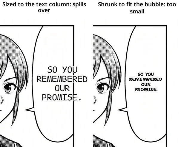
What we saw: the text stayed inside every bubble, but in narrow ones it was too small to read comfortably.
Why: we kept every word whole and reduced the font size until the longest word fit on one line. In a narrow bubble, "REMEMBERED" alone set the size for the whole line, while most of the bubble's height stayed empty.
Fix: use the bubble's height as well as its width. Instead of shrinking, words are stacked on more lines, and a long word may be broken (Problem 4).
Problem 4: hyphenating anywhere produced ugly breaks
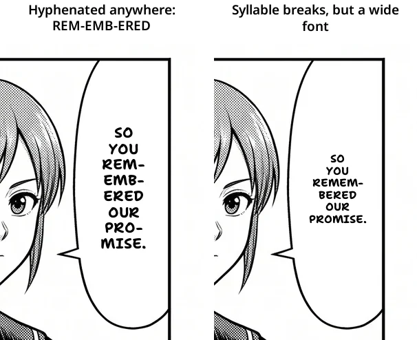
What we saw: our first hyphenation broke words wherever they ran out of room: REM-EMB-ERED, UNB-ELIE-VABLE. Some words broke twice, and short words like PROMISE broke when they didn't need to.
Why: the line breaker filled each line to the last letter that fitted, with no idea of syllables, and treated hyphenation as a normal tool rather than a last resort.
Fix: hyphenation now follows the letterer's rule, "avoid it unless it's the only way":
- A word is broken only if it cannot fit on a line by itself, never just to fill a line.
- Breaks happen after a prefix (UN-, RE-, EVERY-), before a suffix (-ABLE, -MENT, -TION), between two consonants (REMEM-BERED) or before a consonant and vowel (PRO-MISE), with at least three letters on each side. Among the allowed breaks, the most even split wins.
- Each word breaks at most once, and each bubble gets at most two hyphens.
- Hyphenated text is used only if it is clearly larger, at least 15%, than the unhyphenated layout.
Problem 5: the font was too wide
What we saw: with good breaks, narrow bubbles were still lettered small.
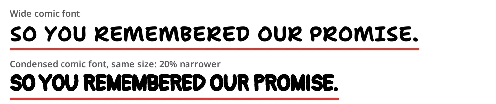
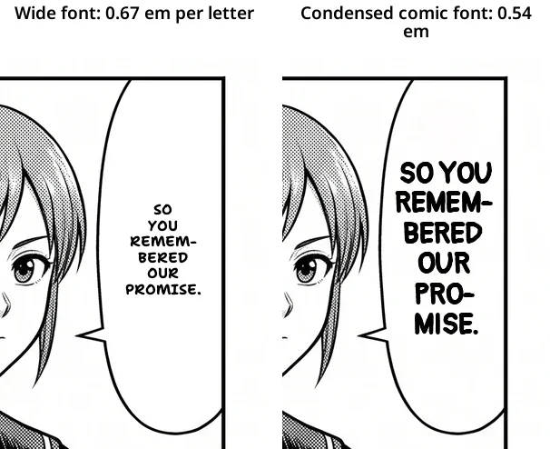
Why: our first default lettering font was a bold, rounded comic font about 0.67 em per letter. Comic lettering fonts are condensed, typically 0.5 to 0.55 em per letter. In a bubble whose width is the limit, a font 20% wider means text 20% smaller.
Fix: we measured the average letter width of more than twenty free comic and handwriting fonts and kept only those that cover every Latin and Cyrillic language we support, including Vietnamese, Turkish, Polish and Ukrainian. The new default is a condensed comic hand at 0.54 em per letter, set slightly bolder.
Problem 6: ragged lines and words left on their own
What we saw: some bubbles ended with a single word on the last line, and some had different text sizes from the bubble next to them.
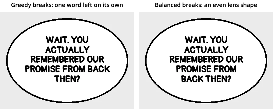
Why: two separate causes. The line breaker was greedy: it filled each line as much as possible and left whatever remained for the last line. And each bubble picked its own largest size, so a roomy bubble got big text and a tight one got small text.
Fix:
- Balanced line breaks. For each candidate number of lines, we pick the breaks that fill every line evenly for the bubble's width at that height (the smallest total squared leftover space). In an oval bubble that produces the lens shape letterers aim for, and no word is left on its own.
- One size for the page. We first find the largest size each bubble can hold, then use the median across the page. Bubbles that cannot hold that size go smaller; none go larger.
The result
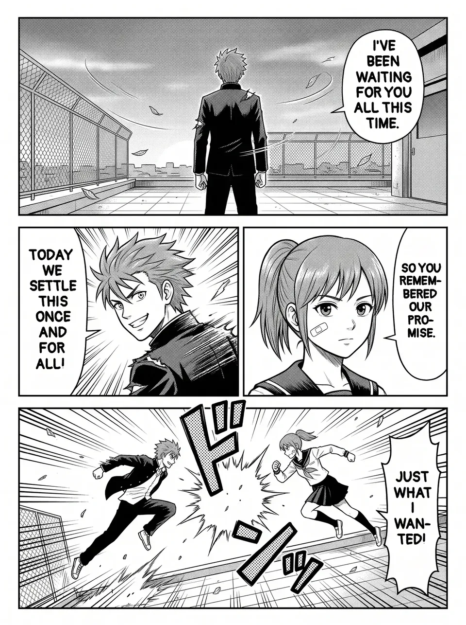
Here is a full page lettered by the current version: every line centred in its bubble, one text size across the page, and the narrow bubble using its height instead of shrinking.
Choosing a lettering font
Each target language has its own set of lettering fonts, and the font menu shows each one previewed in that language's script:
| Target language | Fonts |
|---|---|
| English and other Latin- or Cyrillic-script languages | Manga (default), Standard, Handwritten |
| Japanese | Manga, Standard, Pop, Handwritten |
| Korean | Manga, Standard, Soft, Handwritten |
| Chinese (Simplified) | Manga, Standard, Cute, Brush, Handwritten |
| Chinese (Traditional) | Manga, Standard, Handwritten |
| Thai | Manga, Standard, Cute, Handwritten |
| Arabic, Persian | A font made for the script |
For English, Manga is a condensed, bold comic hand that fits narrow bubbles best, Standard is a clean sans-serif for reading comfort, and Handwritten is a loose, slanted hand for quiet moments, diaries and slice-of-life.
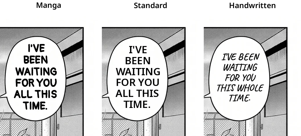
Every font is an open-source font, and each one was chosen only if it covers the characters its language needs: the accented letters of Vietnamese, Turkish, Polish, Czech or Romanian, Cyrillic for Russian, Ukrainian, Serbian and Mongolian, and the full common character sets for Japanese, Korean and Chinese.
What still isn't perfect
- Text over artwork. Captions and sound effects with no closed bubble around them are placed by the standard renderer and look less polished.
- Two lines in one bubble. When the detector finds two separate text blocks inside the same bubble, both keep the standard placement rather than being merged.
- Very small or blurry scans. The bubble outline must be clear to be found. Upload the largest version of the page you have.
Tips for cleaner results
- Shorter translations fit better. If a bubble still comes out small, try the Standard translation style, which keeps lines short, rather than Faithful, which translates every word.
- Use the Manga font for narrow bubbles. It is the narrowest of the three, so it keeps the largest text in tall manga bubbles.
- Sound effects stay as drawn. Stylized sound effects are part of the art and are not re-lettered.
Frequently asked questions
What is typesetting in manga translation?
Typesetting is the step after translation where the new text is placed on the page: choosing the font, size, line breaks and position inside each speech bubble, after the original Japanese has been cleaned off the art.
What font is used for English manga?
Professional English manga is lettered in condensed comic fonts, usually in capitals. AI Manga Translator's default Manga font follows that style; Standard and Handwritten are alternatives.
Why is translated text sometimes small in a speech bubble?
Usually because the bubble is narrow, which is common in manga because Japanese is written vertically, and a long word has to fit on one line. A good typesetter, or our layout step, stacks words down the bubble's height, uses a condensed font, and breaks a long word at a syllable before shrinking the text.
Can I change the font after translating?
The font is applied when the page is lettered. Choose a different font and translate the page again; each page uses one page credit.